I love my wife so much. However, for whatever reason, she's under the impression that she loves me more and this has been the most contested issue between us for quite some time. So, like any sensible husband with an analytical background, I needed to quantitatively prove her wrong.
Luckily, I used Google Voice when I met my wife and this allowed me to play with approximately a year's worth of text messages. It took an hour or so to write a hacky parser that counted the number of <3s and the word love per person per week. I also normalized by the total number of text messages with the hopes of sending the data in the correct direction, yet the results weren't too favorable:
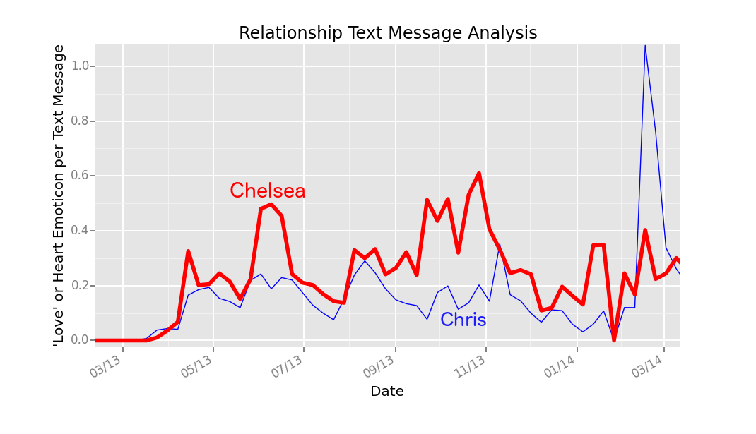
Wow, she clearly loves me more. I was planning to forecast my greater love for her into the future, but screw it! I need to pretend this chart never existed and hope she never reads this post.
Bonus points: Guess when I conceived the idea of this plot?